Furniture China 2019 and Fashion Colors
The 25th China International Furniture Expo
& Shanghai Maison are based on the theme of “999-Unbounded Color” and
summarizes 9 ways of communication: with AI, with the public, with family, with
lovers, with friends, with colleagues, and with Netizens, with themselves, and
nature which have created nine different spaces to interpret the story of the
popular colors of China's home furnishing industry in the next three years.
Let's having a look at its color application.
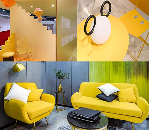
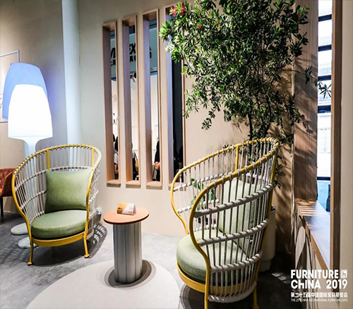
No.1 Lemon yellow -- A variety of interesting spaces when communicating with friends
Lemon yellow, the brightest color, it is easy to have a lively, brisk, natural feeling. The space of the yellow gives a feeling of warmth, just like a whisper between friends, unrestrained, instantly escaping the haze of the heart.
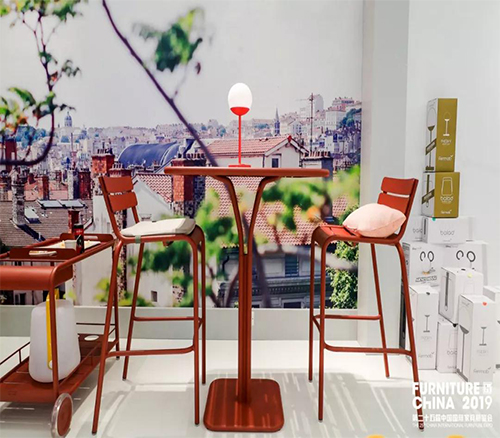
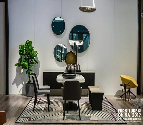
No. 2 Crimson -- Face-to-face companionship between lovers
Crimson, has always been associated with love with "dopamine", like the scent of the lover's ear whispers and the flowers blooming on her face when she feels shy. The space of the red tone is filled with the sweetness and softness, which exudes seductive charm.
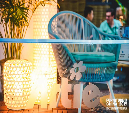
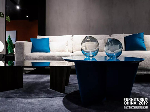
No.3 Azure -- Neutral and changeable workplace
communication
The rain has passed through the azure cloud, and it is transparent and dynamic. The azure space is refreshing and simple, with a clear hierarchy, which creates a delicate balance between tension and comfort, creating a good office communication atmosphere.
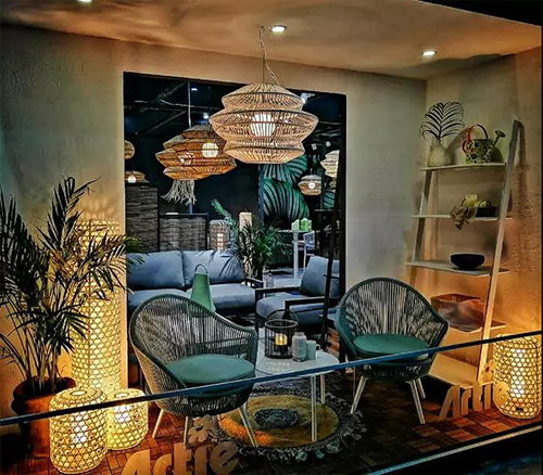
No.4 Light Green -- Ecological space that is
in harmony with nature
Nature's energy magnetic field is
perceptible. Create a space that is green, suitable for rest, recharge, and
repair, so that people who are used to urban life can form a connection with
nature and feel relaxed and free.
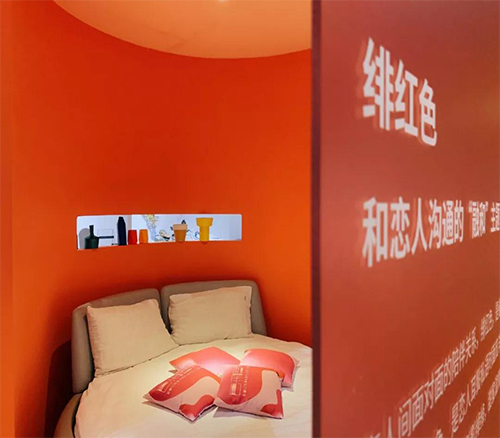
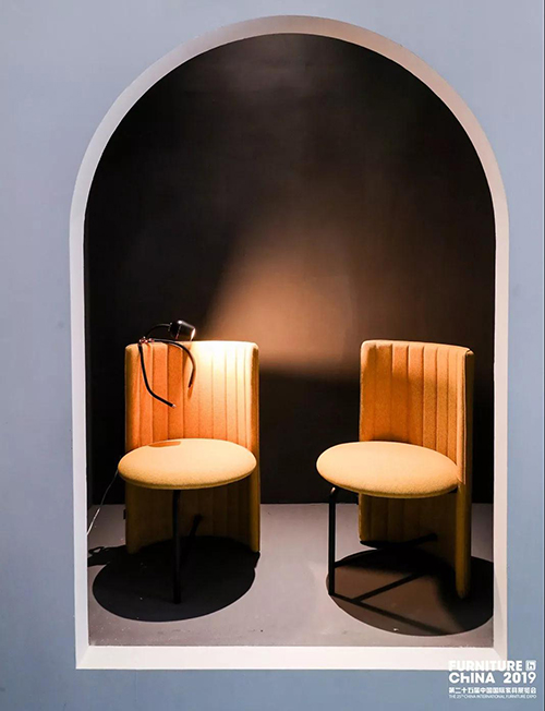
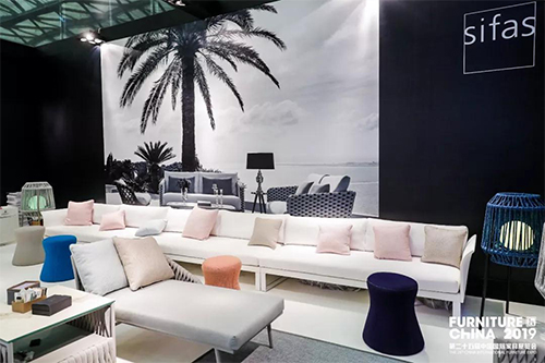
No.5 Sunny Orange -- Gentle and soft belonging
to the family
Orange, neutralizing the warm red and
yellow sparkles, giving a warm, comfortable visual experience. The intimate
conversation between family is like a gentle orange light, through the palm of
your hand to the heart, letting people shine through the bones and radiate a
unique and beautiful temperament.
No.6 Black -- Hidden world behind the screen
Black, dark realm, like the mystery of
black holes. The black space is used to interpret the infinite possibilities of
communication between netizens. Through the edge of reality via network, and
the intersection of people at the other end of the screen, showing the
contradiction between the hidden reality and the virtual exhibition.
No. 7 Moonlight White Closed pure space of self communication
White, simple and clear, gives people a
fresh and comfortable feeling, returning to the sense of calm. The white space
is used to express the communication between man and self. It is like talking
to himself and all true and pure, examining the inner heart, absolute
confession, and returning to the most authentic self state.
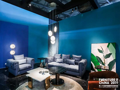
No. 8
Blue -- Contact in public space
“Public” means“people”. public spaces need
to present an all-encompassing and orderly communication environment. The cool
blue color can weaken the emotional needs of different individuals in the
public environment, creating an atmosphere full of order and calm
introspection.
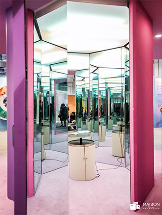
No.9 Purple -- Communicate with AI
Purple, a combination of warm red and cool
blue, conveys a creative inspiration. The purple space is a metaphor for
exploration and wisdom which is full of dreams and technology. It reflects the more possibilities and
infinite development space of human and AI intelligent connection.