
2019 Trend Color and Home Design
At the recent New York Fashion Week, PANTONE, the color trend authoritative agency has released 2019 spring and summer fashion colors. A feeling of those color have been given not only for saturation and enthusiasm but also for full of energy and personality. If we can skillfully apply those to our home design, it will definitely make you say goodbye to a "plain" design!
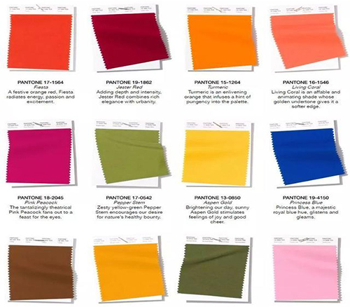
No.1 PANTONE 17-1564 Fiesta
Fiesta is filled with a festive and lively atmosphere, just like a woman's scented red lips. It`s sexy and charming, enchanting and beautiful. It's actually an orange-red hue, but it's more exciting than red, more enthusiasm and more fashionable than orange.
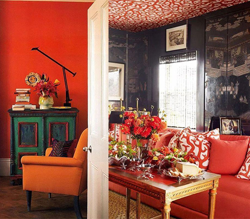
Applying this color with full of enthusiasm and tension to the home design. We can render it in a large area, or make a partial embellishment. All of those can give people a bright feeling, and the ultimate elegance will make you fall in a second.
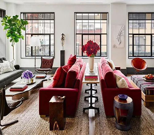
No.2 PANTONE 19-1862 Jester Red
The color of Jester Red is slightly dim, but its elegant, glamorous and charming with a style of urbanism.
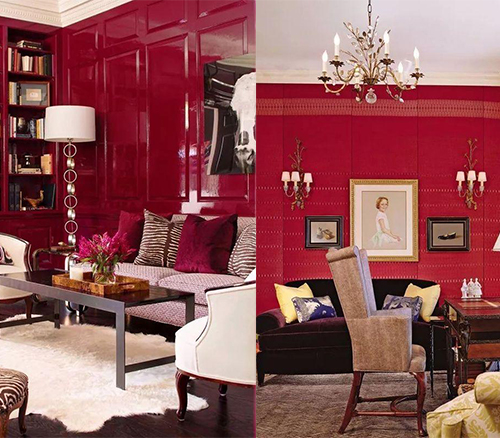
It is an extremely advanced intersperse color in home design. It can be combined with a soft color of similar colors, or collide with a large area of neutral color. It adds a special for a bit of modern fashion.
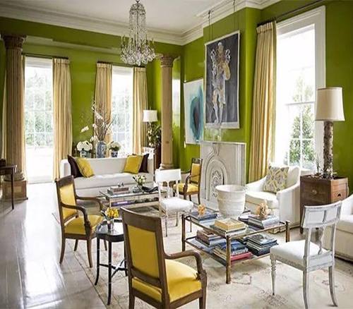
NO3. PANTONE 15-1264 Turmeric
Turmeric has a strongly characteristic, it’s very prefect in lighting bedroom atmosphere. It has a touch of inherent spicy sense, both fashionable and elegant.
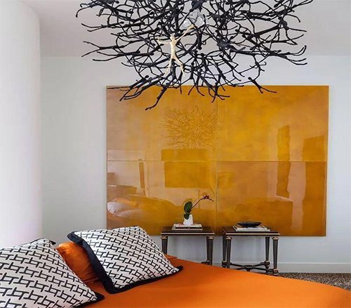
It’s a lively ,cheerful, and warm colour, no matter show as the setting wall with the vintage paintings design restoring ancient ways, build noble and elegant atmosphere; or appear alone to add a bright color for insipid household, turmeric always can make our mood cheerful and have the magical magic power that focuses a line of sight.
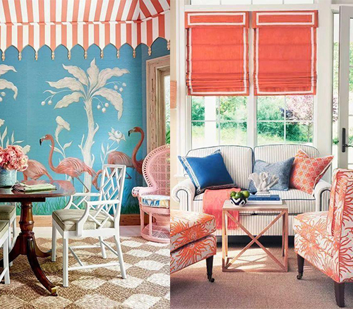
NO.4 PANTONE 16-1546 Living Coral
Living Coral and white, it is a great match that makes melting female bedroom. Elegant, romance and spotless white, the collision of the two not only gives a person a very comfortable feeling, also can create a very beautiful visual experience.
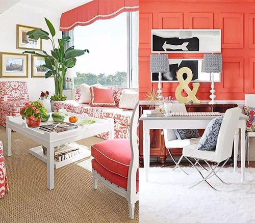
Coral with blue, also can make place oneself in the warmth and romance like seaside beach, add clever glamour for whole space.
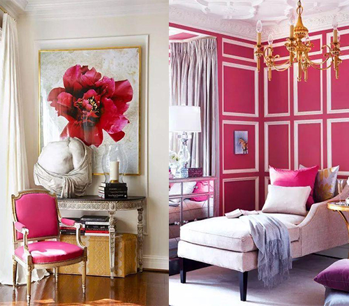
NO5. PANTONE 18-2045 Pink Peacock
Pink peacock is similar to rose red, but it’s more gorgeous and dazzing, Just like the moment when the peacock opens its screen, show a breathtaking beauty. When apply in household, confluence with extremely simple white, aureate or abstruse blue, it will bring the unexpect visual regale.
NO.6 PANTONE 17-0542 Pepper Stem
The fresh color of pepper stem awakens our deep desire for nature. It fuses yellow and green, more refreshing and exuberant. Large-area rendering with Pepper Stem in room, combining the layered of green plant, floral curtain, bed and sofa, can create a nature rural style with tranquility ,comfortable and leisurely.
Colour is a perfect tool in design, if matching appropriately, it will give you the new signings.
